How your website looks and feels plays an essential role in creating a strong relationship with your customers web design.
Traditional web design is slowly becoming obsolete since most visitors use mobile phones instead of desktop computers to browse the internet. Mobile devices are responsible for 54% of all website traffic in 2021 —a trend that will increase in the future.
That’s why your website needs a responsive design that offers the same experience on all devices. A responsive website design will help you increase engagement and conversion rates while strengthening your relationship with your customers.
So stick around because in this blog, we will explain all the how’s and why’s of responsive web design.
- Responsive Website Design Explained
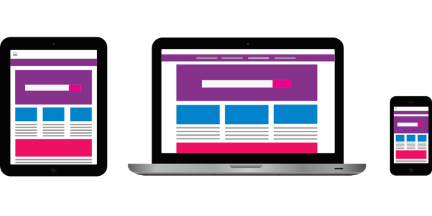
The need for a responsive website design has exploded in the past few years as more and more people surf the internet using their mobile phones and tablets. A responsive website design is the most popular web design approach that offers the same experience on all devices.
The key here is to create a website that looks and feels exactly the same, no matter what device your customers use to access your site. Responsive design renders the site according to the screen size without losing any quality in the process.
That way, you’ll have the widest reach, and your site will offer the best user experience to every visitor.
Importance of Responsive Website Design
As mentioned above, the world has reached the point where most internet traffic comes from mobile devices.
This trend has been growing for years, and it has slowly redefined the way we interact with the online world. There’s no doubt that you need your business website to be responsive if you want to grow your brand. Here are a few reasons why::
1. Exponential Mobile Growth
The current estimates say that there are over 3.6 billion smartphone users on the planet. That means that almost half of the world’s population uses a mobile device to go online. That gives you 3.6 billion reasons why you need a responsive website design.
Moreover, the number of mobile users will keep growing steadily in the next few years, which will give you access to even more potential customers.
Of course, everything depends on your business and targeted market, but having a responsive website won’t do you any harm. Our friends from the Florida web design company use this approach to help clients grow their businesses year after year .
2. Higher SEO Ranking
Google introduced the mobile-friendly update that promotes responsive websites in 2015.
This means that all mobile-friendly websites rank better on the search engines than those that don’t have a responsive design.
Google realized that most of the website traffic would move to mobile devices almost six years ago. All websites that have features such as readability without zooming, improved spacing and so on now rank higher than desktop-first websites.
As a website owner, you want your site to rank as high as possible to get more traffic. That alone should be all the motivation you need to invest in responsive web design.
As long as your site is mobile-friendly, Google doesn’t care about where the servers are located or what language it’s in. Their algorithm focuses on mobile-friendly pages, so if you want your site to appear in the top search results, responsive design is a must.
3. Higher Page Loading Speeds
Page loading speeds also play an important role in search engine ranking. The longer it takes for a web page to load, the fewer visitors it gets.
Keep in mind that there are well over 1.5 billion active websites online, so you have to do everything you can to gain an advantage over the competition.
Providing your visitors with a fast-loading website will help you improve its user experience and increase your conversions. Every second makes a huge difference, especially in the parts of the world that have high-speed internet connections.
If your website loads within two seconds, you will impress your customers and motivate them to spend more time on your site.
4. Benefits of Responsive Website Design
Now that you know how a responsive website design improves your search engine ranking let’s take a look at its key benefits.
1. Cost-Efficiency
Responsive website design came a long way from the traditional approach. Instead of designing different website versions for the users of different devices, a responsive design will help you cater to every customers needs.
In other words, you can save a lot of money by running only one website instead of creating multiple versions for different users.
A responsive website design will make your site look and feel the same on all devices, browsers, and operating systems. It’s, by far, the most cost-efficient way of creating a strong online presence because it offers the same experience to every single user.
2. Better User Experience
Giving your audience the best user experience possible will help you grow your business.
A responsive web design is a must if you want to engage more visitors and increase conversions. No one will waste their time trying to navigate an unresponsive website in 2021.
That is especially true if you’re running an eCommerce business since a mobile-friendly experience increases sales by as much as 73%.
3. Lower Maintenance Costs
A responsive design can drastically reduce website maintenance costs and efforts.
Responsive websites are much easier to maintain since all the changes you make affect users on all devices. This way, you can manage your whole online presence on a single platform, making it easier for your customers to remember your brand.
Of course, you might want to test new features and design solutions in the future, but everything you do will become visible to all users.
When compared to the traditional multi-website design approach, the maintenance costs are lower and management is much easier.
4. More Accurate Data Analytics and Reporting
Working with a single responsive site means that you won’t have to track conversions, user journeys, and sales funnels individually on multiple websites.
You will be able to get more accurate data using tools such as Google Analytics. Better data quality means that you’ll be able to find better target audiences and simplify monitoring efforts.
5. More Visitors and Higher Sign-Up Rates
Lastly, a responsive website will show your customers that you’re in tune with the latest trends.
Your site will have a modern look that will make your products or services more compelling to your visitors.
Moreover, with the right calls to action, and a well-designed landing page layout, your website will make it much easier for the visitors to convert.
Testing Your Website For Responsiveness

Now that you understand why a responsive website is a must, you have to know how to test your site for responsiveness. Here are some tools that will help you do that.
- Browser Developer Tools
Google Chrome comes with a built-in feature that allows you to test your website’s responsiveness.
Other popular browsers offer similar features, enabling you to test the responsiveness of your site. Try opening the site using different devices, including a desktop computer, a laptop, a mobile phone, and a tablet.
You can test the site’s responsiveness on your laptop by opening it in your browser, clicking the right mouse button, and then hitting “Inspect.”
You can then resize the window to see if the content expands and shrinks to fit different screen sizes. If the content stays intact, your website is responsive.
However, rescaling is only one part of the process. You also have to ensure that all buttons and clickable elements resize with the rest of the content.
- LT Browser
LT Browser is a tool that allows you to test your website’s mobile friendliness.
It comes with various features and over 50 device simulations you can use for responsiveness testing. The software comes with other useful tools that will help you see how your website looks on different devices, such as network throttling and hot reloading.
With those, you can test your site’s performance in different conditions. Use what you find to improve your site’s design and watch your engagement and conversion rates start growing steadily.
- Conclusion
If you want your website to succeed and help you grow your business, a responsive design is a must!
Without it, your site is unlikely to rank high in the SERPs, and you won’t get the visits you need to build a recognizable brand.
Without a responsive design, you will be missing out on potential conversions and business opportunities. As such, implementing a responsive design is one of the best business decisions you can possibly make.
Author bio
- Rick Seidl is a digital marketing specialist with a bachelor’s degree in Digital Media and Communications, based in Portland, Oregon. With a burning passion for digital marketing, social media, small business development and establishing its presence in a digital world, currently quenching his thirst through writing about digital marketing and business strategies for DigitalStrategyOne.


